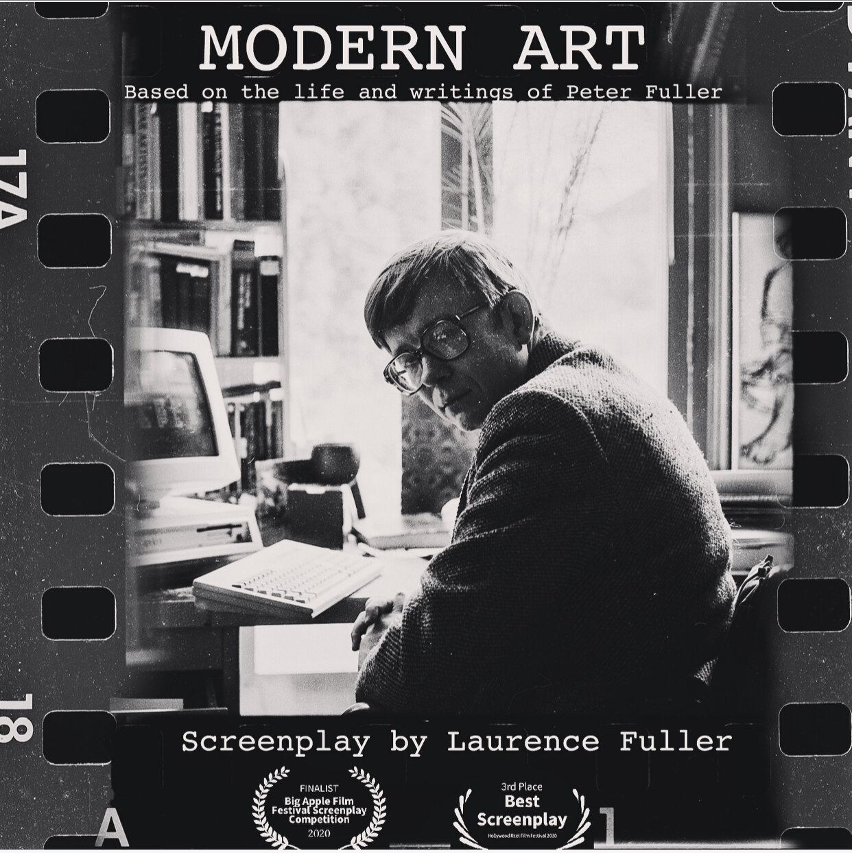
MODERN ART chronicles a life-long rivalry between two mavericks of the London art world instigated by the rebellious art critic Peter Fuller, as he cuts his path from the swinging sixties through the collapse of modern art in Thatcher-era Britain, escalating to a crescendo that reveals the purpose of beauty and the preciousness of life. This Award Winning screenplay was adapted from Peter’s writings by his son.In September 2020 MODERN ART won Best Adapted Screenplay at Burbank International Film Festival - an incredible honor to have Shane Black one of the most successful screenwriters of all time, present me with this award:
As well as Best Screenplay Award at Bristol Independent Film Festival - 1st Place at Page Turner Screenplay Awards: Adaptation and selected to participate in ScreenCraft Drama, Script Summit, and Scriptation Showcase. These new wins add to our list of 25 competition placements so far this year, with the majority being Finalist or higher. See the full list here: MODERN ART
THE ARTS COUNCIL COLLECTION
by Peter Fuller, 1980

Leon Kossoff, Seated Nude, Arts Council Collection
In 1942, CEMA, the war-time Council for the Encouragement of Music and the Arts, bought works for a touring exhibition of modern British painting. When the Arts Council was set up in 1946, these acquisitions formed the nucleus of its collection, which now comprises some 5,000 items. (A catalogue is available.) Initially, purchasing was carried out with chronological exhibitions (e.g. ‘New Painting 58-61 ’ in mind.) During the 1970s, however, the Council invited individuals to purchase around a theme, (e.g. Boshier’s ‘Lives’, Fuchs’s ‘Languages’, Causey’s ‘Nature as Material’).
The Council’s policy of appointing different purchasers each year is, I am convinced, a good one. It is a way in which the individual judgement necessary to aesthetic discrimination could be preserved without permitting an undemocratic accretion of power within the purchasing institution. Nonetheless, I think that recent acquisitions have suffered through the choice of purchasers, and the brief which they have been given. The qualities of a work are constituted neither by its position in art history, nor by its style, nor yet its subject matter. The thematic selections of recent years indicate that the Council has failed to appoint purchasers with a true critical intelligence in painting and sculpture. This fatal refusal of the ‘aesthetic dimension’ is accentuated by the decision in the early 1970s to start adding photographs to the collection, and cataloguing them as if they could be equated with paintings and sculpture, on the grounds that they are also ‘images’.
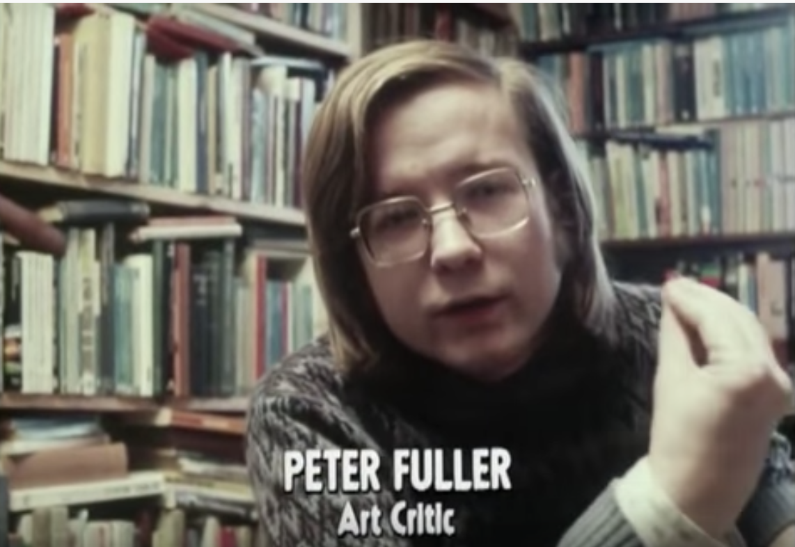
If some works which ought never to have been purchased found their way into the collection on ‘stylistic’ or ‘thematic’ grounds, others, which ought to be represented, have been excluded for similar reasons. A policy which permits the acquisition of inconsequential, anaesthetic items by Nigel Hall, Stephen Willats and Victor Burgin, and which yet excludes anything by painters of the stature of John Ward, Peter Greenham, and Bernard Dunstan, cannot be regarded as perfect. Nonetheless, despite the self-evident lacunae, I think that the Council’s collection gives an insight into post-war British art as good as any, and I want to use the recent exhibition of a selection of some 400 items from it, at the Hayward Gallery, as an opportunity for some self-critical stock-taking. It is now more than three years since I published ‘The Crisis in British Art’ (see Art Monthly, nos 8 & 9). That article began by asking the question, ‘What has gone wrong with the visual arts in Britain in the 1970s?’ I was worried (with good reason) about the absence of significant art in the decade within which I was growing up as a critic. I tried to analyse the decadence of the 1970s in the light of what had happened since the second world war. And so I was concerned with exactly the terrain covered by the Arts Council collection.
In 1977, I argued that, for historical reasons, the British Fine Art tradition emerged belatedly and remained weak. In the twentieth century, it was threatened by the growth of what I call a ‘mega-visual tradition’; i.e. all the means and processes for producing and reproducing images, from modern advertising to television, which proliferate under monopoly capitalism. Thus the artist lost his cultural centrality and social function, and the great traditional media—painting, sculpture and drawing—fell into decline. I felt that British art was further vitiated by American hegemony in the 1960s, and thinned out by the recession of the 1970s.
In general, this analysis still seems sound. The collection reveals just how few works of stature or quality were originated in the 1970s. Nonetheless, I can now see that my criticisms were, to some extent, contaminated by the disease they sought to expose. Today, I hardly need reminding that the qualities of a good painting are not constituted wholly within ideology. But, three years ago, I failed to grasp fully the implications of the fact that painting, sculpture and drawing differ from mechanical media in that they are (before anything else) material processes involving, although differentially, imaginative and physical human work and biological processes. This weakness in my theory of course corresponded to a weakness in the prevailing art practice: at that time, one encountered little good, new painting or sculpture that transcended ideology.
Even then, of course, I retained and expressed a notion of what painting and sculpture might be. But a residue of ‘leftist’ modernist idealism caused me to underestimate the concrete, aesthetic achievements of an indigenous, oppositional tradition of painting which had consistently set its face against the prevailing decadence. This is one reason why I missed the point of Ron Kitaj’s purchase exhibition for the Arts Council collection in 1976, ‘The Human Clay’. I accused Kitaj of trying to ‘re-invoke the visual conventions of an earlier historical moment’: I failed to recognize that in all historical moments, men and women are made of ‘Human Clay’. Kitaj was attempting to root aesthetics in that ‘relative constant’ of human experience, the body, with its not unlimited potentialities, as a means of escaping from the ideological vicissitudes of late modernism. Today, I still do not accept Kitaj’s antiabstractionist bias. (As I have shown elsewhere, the expressiveness of abstract art can be rooted in somatic experience too.) Although ‘The Human Clay’ was certainly uneven, I recognize that my earlier polemic against his position was over- historicist, and I retract it.
Indeed, in the year’s since 1977,1 have come to put a higher and higher estimate on the work of a number of artists whom Kitaj has also championed. (What a pity, incidentally, that the only painting by Kitaj himself in the Arts Council collection is such a feeble work. He is a very uneven painter: Screenplay is of little merit. Whoever selected it must lack a good eye.) Auerbach’s Hayward exhibition, in 1978; Kossoff’s show at Fischer Fine Art in 1979; Creffield’s 1980 shows; and the exhibition of late Bombergs at the Whitechapel impressed upon me just how solid the achievements of these artists are. My 1977 article failed to discuss them at all: this was an omission for which I can plead nothing better than inexcusable ignorance.

David Bomberg, Self-Portrait, 1937, Arts Council Collection, London
But the exceptional qualities of the late Bomberg paintings were brought home to me vividly at the Hayward again. I have tried to analyse the peculiar power of these works elsewhere. (See Beyond the Crisis in Art). Here, I can proffer only value judgements. Bomberg’s Self Portrait (David) of 1937 struck me as easily the best painting in the unimpressive ‘Thirties’ exhibition at the Hayward in 1979. How good it was to see it again! His tautly sensuous painting, Trendrine, Cornwall, of 1947, was not only in my view the finest single work on show from the Arts Council’s collection: it also demonstrated just how much better a painter Bomberg was than either Pollock or De Kooning in the mid-1940s. In the late Bomberg, we encounter a truly major artist of a still-unsung indigenous tradition: but the scale of his achievement has hitherto been obscured through a perverse infatuation of the British art world with American late modernist modes.
Indeed, the Arts Council collection confirms that the impact of ‘The New American Painting’, first shown at the Tate in 1959, was like a dose of anaesthesia rather than an innovation. (Berger, incidentally, was the only critic of the day who had a good enough eye to perceive this.) By this time, Abstract Expressionism in America had already gone through its metamorphosis from living struggle into dead ideology. And so it came about that a stars-and-stripes spangled screen was drawn over the authentic example offered by the late Bomberg, his finest pupils, and other lesser but equally dogged British practitioners.
You could see this clearly at the Hayward. All you had to do was to compare two consecutive sections of the collection. One contained works made by British artists immediately before the invasion; the other displayed works by younger painters and sculptors influenced by it. Now I should be clear about what I am saying here. Evidently, not everything in the earlier section was of even quality. Kossoff’s Building Site, Victoria Street of 1961 seemed to me a muddy and confused painting in terms of touch, colour, space and composition. What a contrast with the adjacent Seated Nude which he painted just two years later! Similarly, I was not convinced by Auerbach’s Primrose Hill of 1959—though his drawing Head of Brigid, of 1973/4 (hung in the drawing section) was truly consummate, the work of someone who had really mastered that difficult medium.

Frank Auerbach, Head Of Catherine Lampert
But the point about the works in this section was that in them one could feel the struggle, often pursued through radical aesthetic means (no one had ever previously applied paint like Auerbach and Kossoff), towards a genuine expression: sometimes this coalesced into a convincing picture. (For example, within its own terms, I found it hard to fault Sheila Fell’s landscape with figure, Woman in the Snow, of 1955). Sometimes the artist failed. But in almost all of this work, I felt the urgency of an authentic imaginative quest and perceived the concrete evidence of it in the material handling of paint substance and pictorial conventions. Even the failures were often interesting. Thus, although Kossoff’s Building Site did not work, with the advantages of hindsight I could perceive in it rudiments of his masterpieces of the 1970s, his paintings and drawings of a children’s swimming bath and of the outside of Kilburn underground station.
How different the ‘feel’ of this section was from that just up the ramp. Appropriately, Denny called one of his paintings of 1963 Bland. I grant he can match his colours as well as a competent interior designer, but he lacks touch and imagination. Rothko had many imitators: none possessed his acuteness of eye, mastery of painterly means, or, above all, his affective sensitivity and psychological courage. Denny is a plastic Rothko. But, weak and ineffectual as Denny’s work is, it is perhaps unfair to single him out. There was not one good, or even interesting, painting in this section by Cohen, Hoyland, Stephenson or anyone else. It served merely to illustrate the shabbiness and opportunism of ‘Situation’ artists. They were stylists, borrowing the ‘look’ of American art. But a duck-arse hairstyle did not turn Cliff Richard into Elvis Presley: these painters were never Pollocks, Rothkos, or De Koonings either. Twenty years on, the tattiness and inauthenticity of their plagiarism is clear for all to see.
One artist interestingly spans both sections: the sculptor, Anthony Caro. He was almost destroyed by trans-Atlantic influence as the contrast between his ‘before’ and ‘after’ sculptures demonstrates. Caro’s Woman Waking Up of 1956 is an arresting if not quite achieved little work. It shows a woman lying on her back. Her slightly arching upper torso is roughly parallel to a flat, supporting plane; her right hip, however, swivels over towards her left side. The body is structured expressively, rather than on the basis of anatomy or perception alone. The sculpture depicts that moment of dawning consciousness and muscular awareness in which one emerges from sleep. The mouth is a slouching slit. The head is small, stuffed into the shoulders: the arms seem to spring directly from the great, flattened breasts.
Sculpturally, there is quite a lot wrong with the figure. Its two halves pivot around the narrow waist but are not brought into a unity through a continuous movement. There is slack work in the handling of the right leg, feet and left arm. The expressive distortions—like the lop-sided swelling of the right side of the chest—are not always convincing. Nor does the figure work equally well all the way round: it is much better seen from over the back of the hips from where its formal weaknesses are less visible. There is also a rhetorical, even theatrical element in the piece which seems to be an attempt at compensating for its sculptural deficiencies. But when all this has been said, Woman Waking Up is clearly an authentic and sculpturally imaginative work, created by a sculptor of evident potential.

Anthony Caro, Slow Movement, 1965, Arts Council Collection, London
However, Caro’s Slow Movement, up the ramp, illustrates how that potential was squandered. Slow Movement is a placement, or arrangement, of three flat, painted steel elements, (a trapezoid, a triangle, and an angle iron.) The emergent sculptural imagination of the earlier piece has been stifled: the search for authentic expression using the haptic and volumetric skills peculiar to sculpture has just been abandoned. Certainly, a residue of Caro’s earlier project survives. (Compare the way the triangle meets the trapezoid with the figure’s pivotal waist.) This is why Caro is so much better than those who followed him: they had no real experience of the sculptural enterprise.

Anthony Caro, Woman Waking Up, 1956, Arts Council Collection, London
The tragedy of Caro is that an artist with so much incipient talent should have settled for so little and misled so many by doing so. Certainly, Slow Movement can be read as a more successful piece than Woman Waking Up\ but Slow Movement is a much slighter piece. In the end, of course, it is essentially a literary or mannerist exercise rather than a true sculpture. I am not just referring to its relinquishment of sculptural means, but also to the fact that it is so evidently based on ideological attitudes rather than a genuine expressive struggle—but this is the trouble with so much British art that became seduced by American modes in the late 1950s and early 1960s. Enough of Caro’s earlier project shows through in his best work of the last twenty years (see, for example, the 1975 piece also in the Arts Council collection) to indicate that he could still become a major sculptor if he summoned up the aesthetic and moral courage to break with the ideology which helped to render him a successful late modernist salon artist twenty years ago.
But it is unlikely that Caro will oblige. Like many artists and critics of his generation, he does not seem to understand what gives rise to quality in art. In 1964, David Thompson introduced an exhibition of ‘New Generation’ artists saying, ‘They are starting their careers in a boom-period for modern art. British art in particular has suddenly woken up out of a long provincial doze, is seriously entering the international lists and winning prestige for itself’. Even today that debasement of British art which occurred in the late 1950s and 1960s is still defended by those lacking in aesthetic sensibilities in these terms. But Caro, I would suggest, was more deeply asleep in Slow Movement than Woman Waking Up: meanwhile, in the midst of their so-called ‘provincial doze’, late Bomberg, Kossoff, Auerbach, Creffield, etc. were producing works of true quality and stature.
I do not want to suggest that ‘The Crisis of British Art’ simply originated in the imitation of American styles and theories. It also had much to do with the tendency of art to become seduced by the ideology of the mega-visual tradition, and thereby to relinquish the particular expressive capacities of the painter and sculptor. In many of my recent articles and lectures, I have tried to sketch out what I believe those particular expressive capacities to be. Evidently, I cannot rehearse all those arguments again here. Suffice to say that I emphasize that painting and sculpture are specific material practices. Good painting, for example, involves a peculiar combination of imaginative and physical work (on both materials and conventions, given by tradition.) When a painter is successful, this leads to the constitution of a new aesthetic whole. I have argued that, in the present social context, the true qualities (and indeed the radical potential) of a painting are literally expressed through these material practices. The point I am making can be vividly demonstrated if one considers the Arts Council’s selection of ‘Pop Art’.

David Hockney, We Two Boys Together Clinging
A work like Hockney’s We Two Boys Together Clinging, of 1961, has real qualities. One can perceive the imaginative and physical work of the artist, his expressiveness, and identify this with the transformation of his physical and conventional materials. But contrast this with Patrick Caulfield’s Artist’s Studio of 1964. It is not just that Caulfield copied so much from Lichtenstein. Nor is it just that Caulfield’s world view is boring and bland: the way in which he realizes it in paint, through a mechanical filling in between the lines with luminous, matt colours, shows that he has no resistance to offer to the ideology of the mega-visual tradition. Like Robyn Denny, he has neither touch nor imagination. It is absurd that we should be asked to look with reverence in the Hayward Gallery at a painting as bad as Artist’s Studio. It is the sort of work one would not be surprised to see in a beach night-club in Benidorm, on the Costa Brava—and even there it would not merit a second glance.
But the collection confirms that the problem with the 1970s was not so much that they rejected the values of the previous decade, but rather developed in a disastrous continuity with them. Caro was the albeit reluctant father of those who abandoned sculptural means altogether; Hamilton sired Burgin, and the silliness of conceptualism. Just as Caro’s early work gives us some intimation of what might have been, so, too, does Hamilton’s sensitive drawing of himself, aged sixteen, hint at what he might have become. Instead, of course, Hamilton chose to relinquish the painter’s means and to toy with the images and techniques of the mega-visual tradition. His Portrait of Hugh Gaitskell as a Famous Monster of Filmland would long ago have been forgotten if it had been, say, an illustration accompanying an article in a colour magazine. Hamilton’s sensibility became merely reflective of the ‘media landscape’ which fascinated him: as an artist, he seems to have died in late adolescence. But there are not, of course, even flickerings of ‘what might have been’ in the wholly anaesthetic offering of Victor Burgin and his colleagues.
There is no doubt that, in the 1970s, the Arts Council acquired some unconscionable rubbish, which will soon be put under wraps for ever. Very little of the work Richard Cork bought in 1972/3 (under the rubric ‘Beyond Painting and Sculpture’) seemed worth any one’s while getting out for this selective exhibition. Yet it is only eight years since Cork bought these things. The trouble is that the Council does not seem to learn from its mistakes.
Rudi Fuchs was specially imported to purchase for the collection in 1977/8. The results of his efforts were shown in an exhibition last year, ‘Languages’, which consisted entirely of specimens of structured ideology: i.e. ‘conceptual’ and related works. In the catalogue, Fuchs wrote ‘Because a painting is Art before it is anything else (for example the image of a tree on a hill) it has become impossible to use painting objectively—as a neutral medium’. He then goes on to say that photographs and texts are ‘closer to the real thing they portray than a painting—provided of course, the photograph and the text are unadorned and plainly descriptive’. The straight photograph and plain text, he says, are ‘almost reality itself’. Predictably, he adds, ‘Look at this art as if it were television; read it as if it were a newspaper’.
On the evidence of this text, Fuchs lacks even an inkling of the nature of art and what is worth preserving in the experience of it. He actually wants ‘neutral media’. He does not understand the imaginative work of the artist, or the way in which he creates a transitional reality, neither objective nor subjective, through transforming his physical and conventional materials into a new and convincing whole. In short, Fuchs seems to lack even the most elementary insight into everything that I mean by aesthetic.
This is no small matter. ‘Renunciation of the aesthetic form’, wrote Marcuse, ‘is abdication of responsibility. It deprives art of the very form in which it can create that other reality within the established one—the cosmos of hope’. But Fuchs actively wishes to serve us up with an ‘art’ which can be looked at as if it were television, or read like a newspaper! If the Dutch want such a man to run one of their leading modern art museums, that seems largely a matter for the Dutch. But why was Fuchs invited to Britain to purchase for the Arts Council?
The Council still has not learned what a disaster it was in the early 1960s when art administrators started all that talk about waking up from ‘a long provincial doze’ and entering ‘the international lists’. The decision to invite Fuchs shows just how entrenched that sort of thinking still is. The historian, Edward Thompson, has recently argued that the true vandals of British laws, customs, and liberties in the 1970s were ‘not the raging revolutionaries of the “extreme Left” but Lord Hailsham, Mr Silkin, the judges in their ermine, the peers of the realm’, and so forth. Similarly, I am often convinced that the true vandals and philistines are habitues of 105 Piccadilly: it is for those of us who are dubbed the ‘extremists’, to uphold value and quality in art. Perhaps this is not surprising. As Marcuse pointed out, the aesthetic and subjective aspects of art constitute ‘an antagonistic force in capitalist society’.
1980